After Hours - Burlesque Illustration
Earlier this year I attended a few burlesque shows by The After Hours Cabaret Club which is featured in the enchanting Melba Spiegeltent. The show had a wide range of varying acts and performances, all unique from one another and equally entertaining. Some made us laugh, other made us cringe, and the audience went wild to every last one.
The experience was very fun and inspired me to create an illustration based on my experience. I also had plans to turn the illustration into a promotional poster for the event. I wanted to include all of the performers and capture each reaction from the crowd.
The experience was very fun and inspired me to create an illustration based on my experience. I also had plans to turn the illustration into a promotional poster for the event. I wanted to include all of the performers and capture each reaction from the crowd.
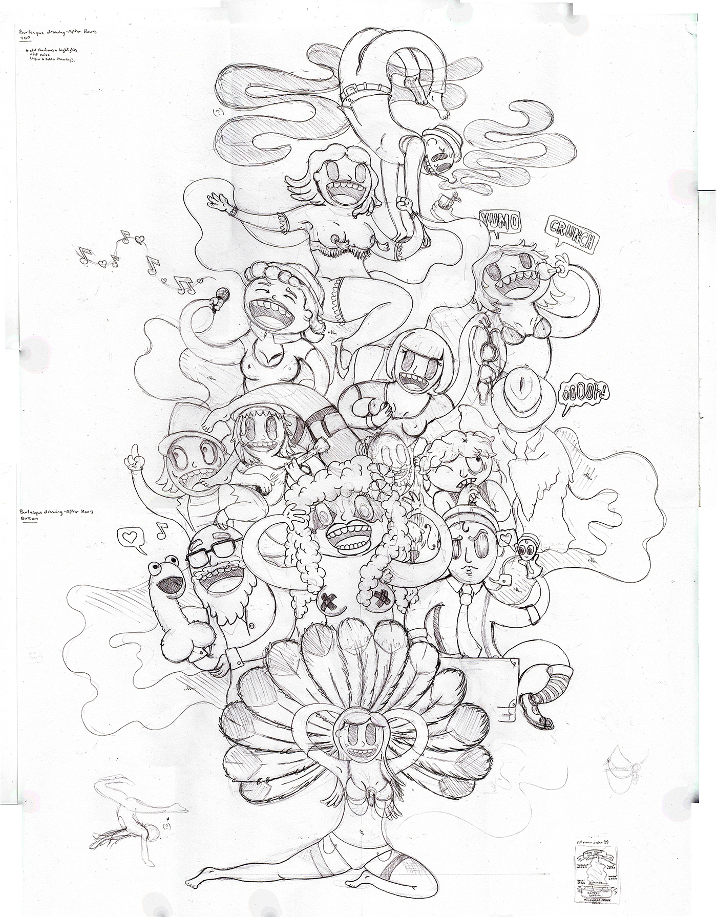
The concept began with rough messy scribbles, which then eventually formed into a sketch. There were some reference imagery handy, which helped shape the poses of some characters.
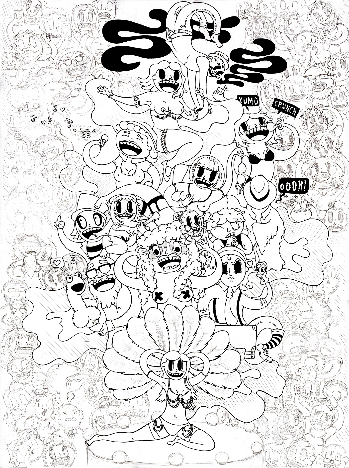
My initial intention with this illustration was to keep the performers separate from the audience so both kinds of characters stood apart from each other and didn't get lost in one giant mess. Once I was happy with the main characters (stage performers), I sketched over them in thick ink and lastly added in the audience. I wanted these characters to show the varying reactions from the audience - some were cheering and chanting, others drooling and lusting, some drinking beer and having a good time, some cringing and in shock (they kept us on the edge of our seats!), and others filming on their mobile phones.
If you look carefully, there's also once stage character in the audience (Tease Rex: A seductive inflatable dinosaur costume). The dinosaur snuck through the crowd before doing a hilarious strip tease.
If you look carefully, there's also once stage character in the audience (Tease Rex: A seductive inflatable dinosaur costume). The dinosaur snuck through the crowd before doing a hilarious strip tease.
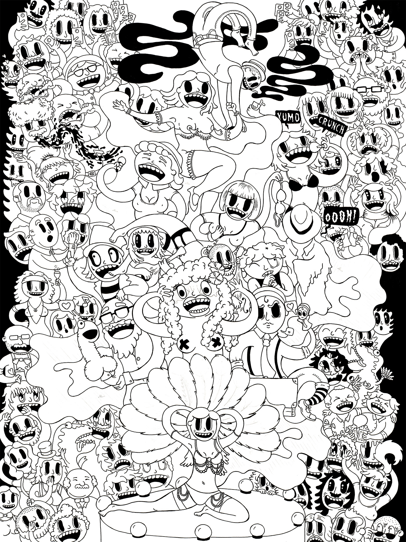
I finished the illustration off by going over it all in ink, scanning it onto my computer and beginning to make some digital adjustments.

I wanted the colours to capture the stage light colours from the night. There were bright red and blue lights with mixes of purple. I decided to create two separate swatches for the stage characters and audience characters. The stage characters had a much more vibrant colour scheme as I wanted them to stand out the most. This showed that they were in the spot light and they're the characters to focus on. For the audience I used much darker tones to help create some depth and show draw attention toward the stage characters.
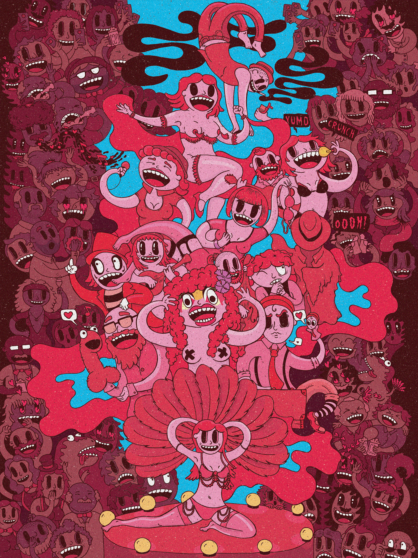
This is the final drawing which I'm very happy with. I colours have turned out just how I pictured them. I also added some highlights and shadows to the main characters to help the illustration not look so flat and to also emphasise the presence of stage lights. I also added a subtle texture at the end which helps give the final artwork a carnival feel.
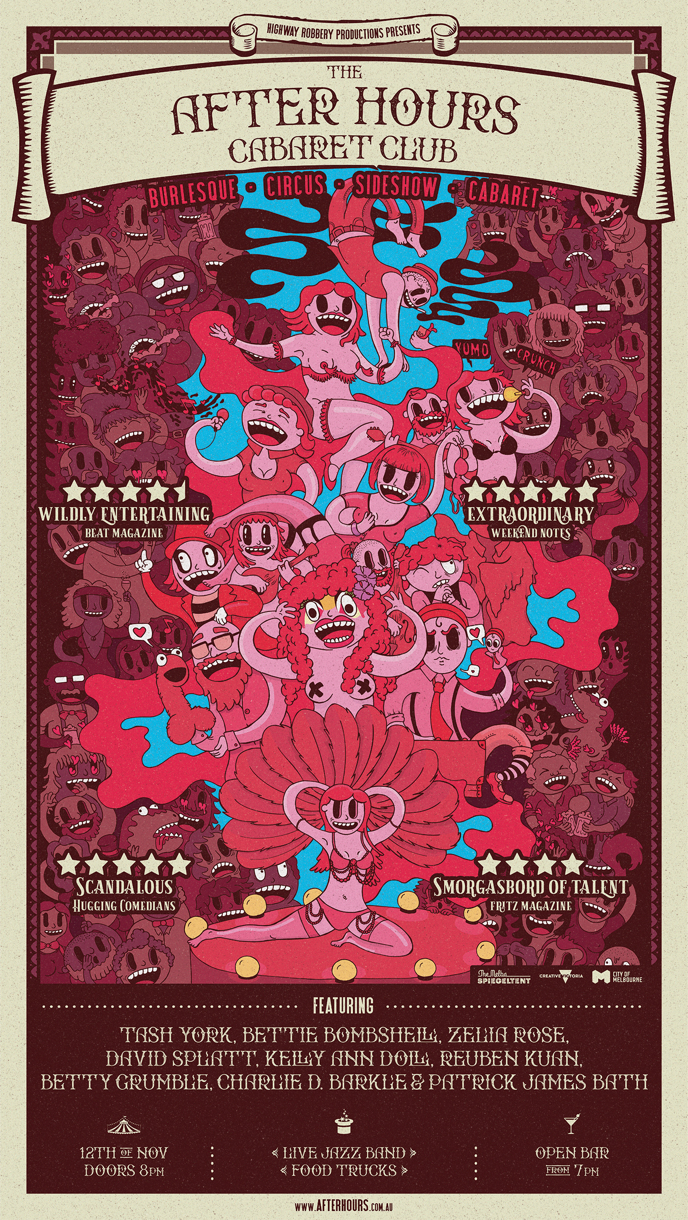
The final illustration on the final promotional poster. I designed the poster too which was just as fun as creating the illustration!
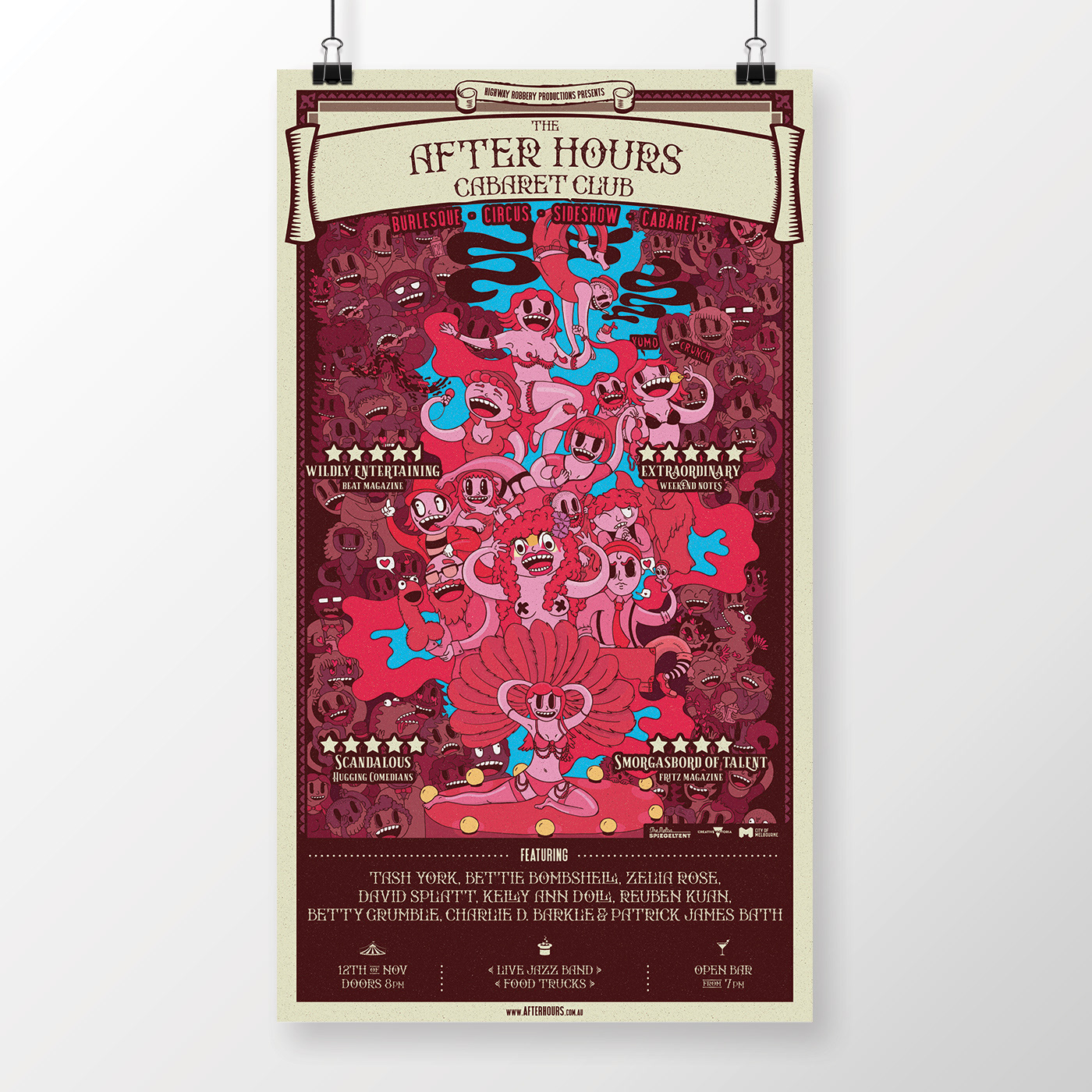
Mock-up promotional poster.
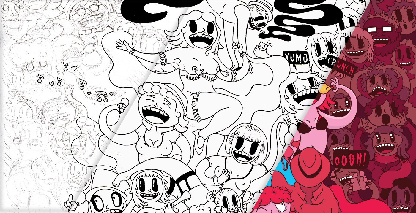
A cropped section of the illustration showing each step of the process: sketching in pencil, drawing in ink, and digitally colouring.
Thank you very much for looking at my work. I hope you enjoy it. As always, it was so much fun putting this together.
Spread the love and click 'Appreciate'.
Spread the love and click 'Appreciate'.