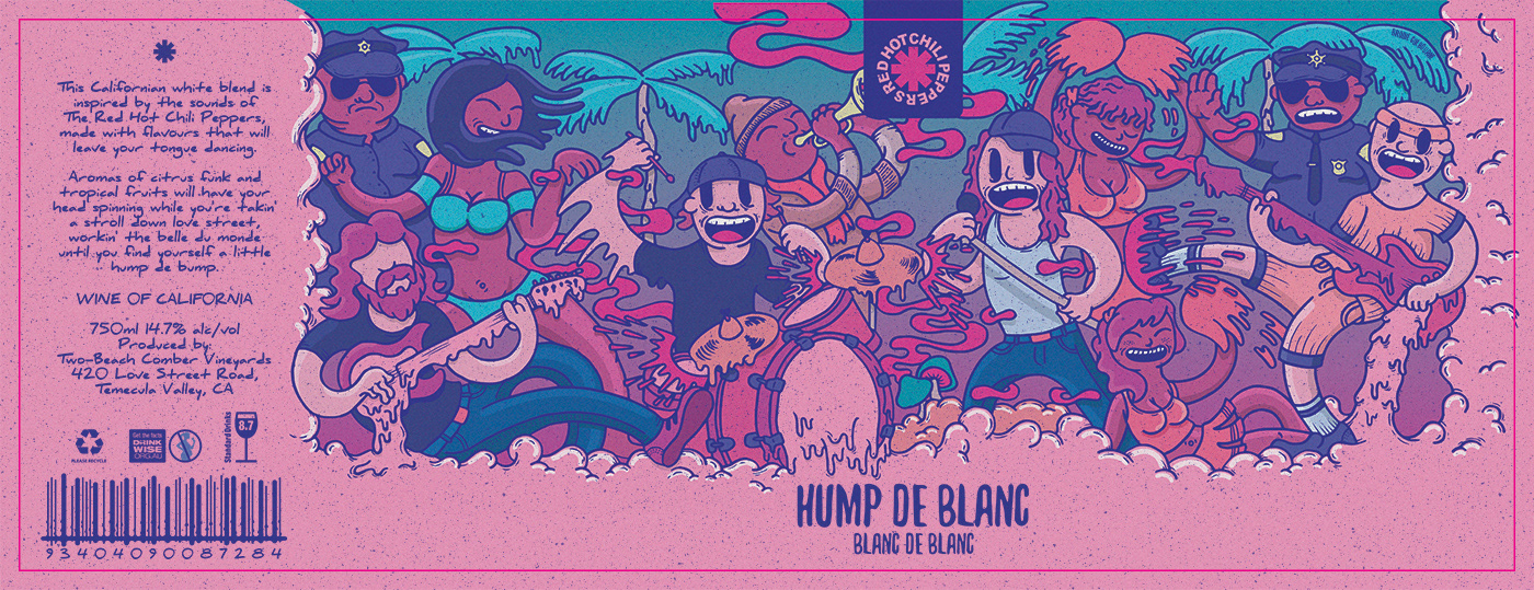
I am a big fan of The Red Hot Chili Peppers and wine, and decided to create an illustration that would capture the music of the band, and design a wine label out of it.
My initial idea for this project came from the white blend blanc de blanc, which reminded me of the song Hump De Bump. I decided to combine the two together to create the name of the wine: Hump De Blanc.
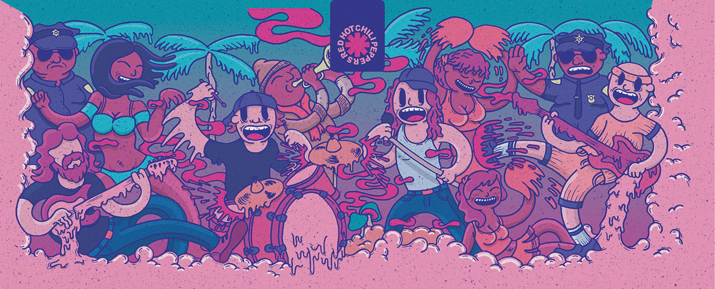
Final Colour Illustration.
The Process:
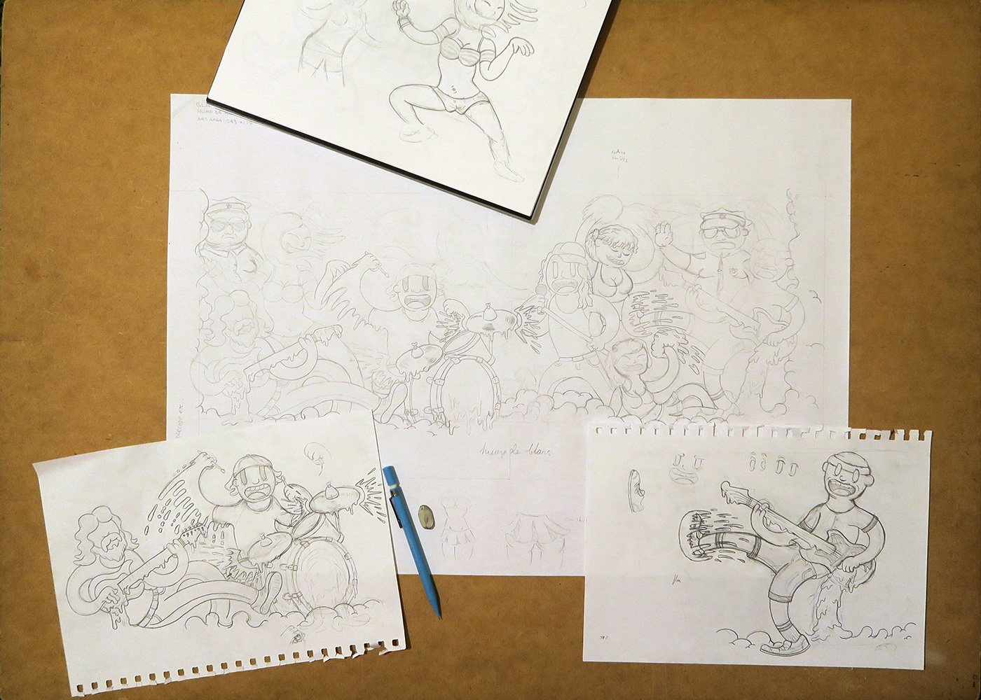
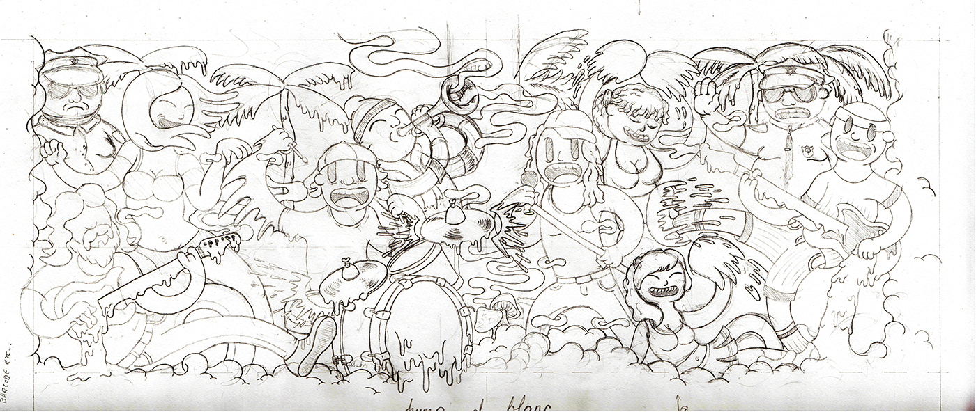
Watching the music video for the song, I began to sketch characters of the band members and other characters to surround them. I wanted the music to pour and flow from the instruments.
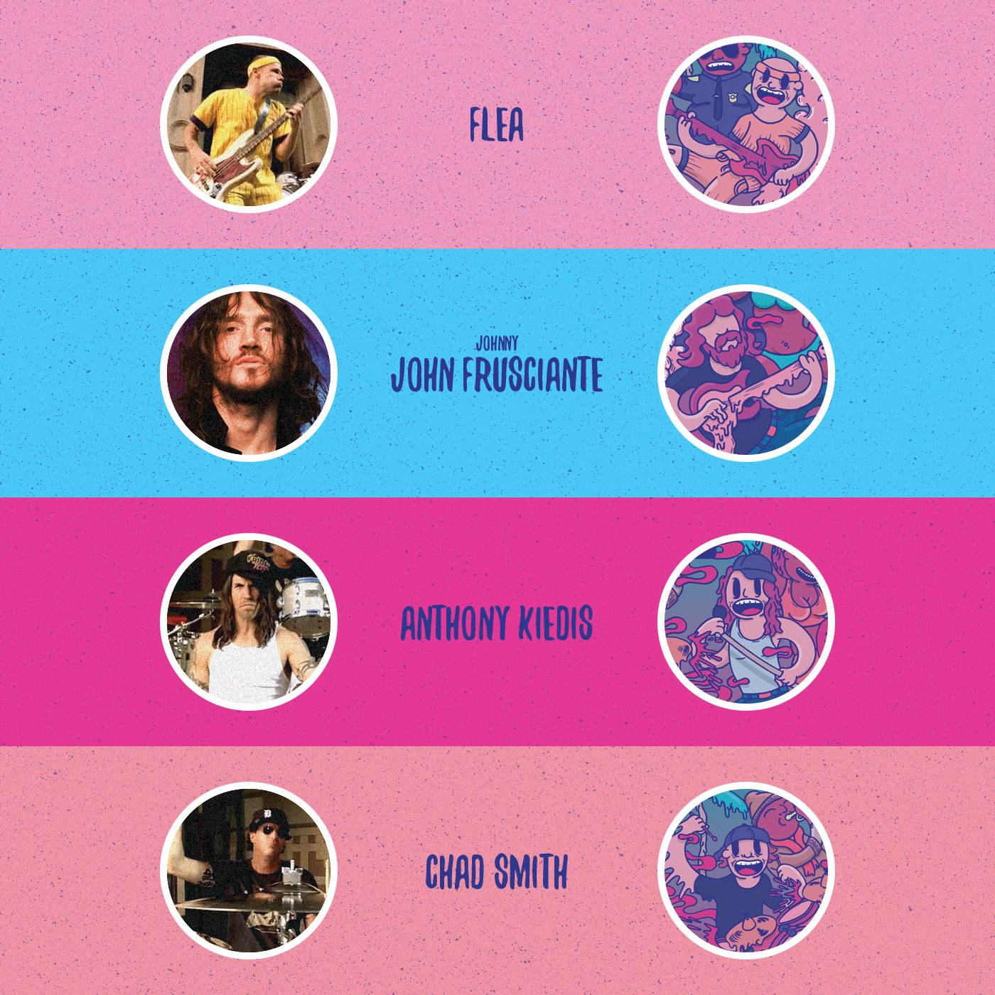
Below are reference images I used for the band members, and how they translated into illustration. Flea is a very animated person and I wanted his character to reflect this amount of energy. John Frusciante seems more relaxed and laid back, so his character is in a much more reclined position.
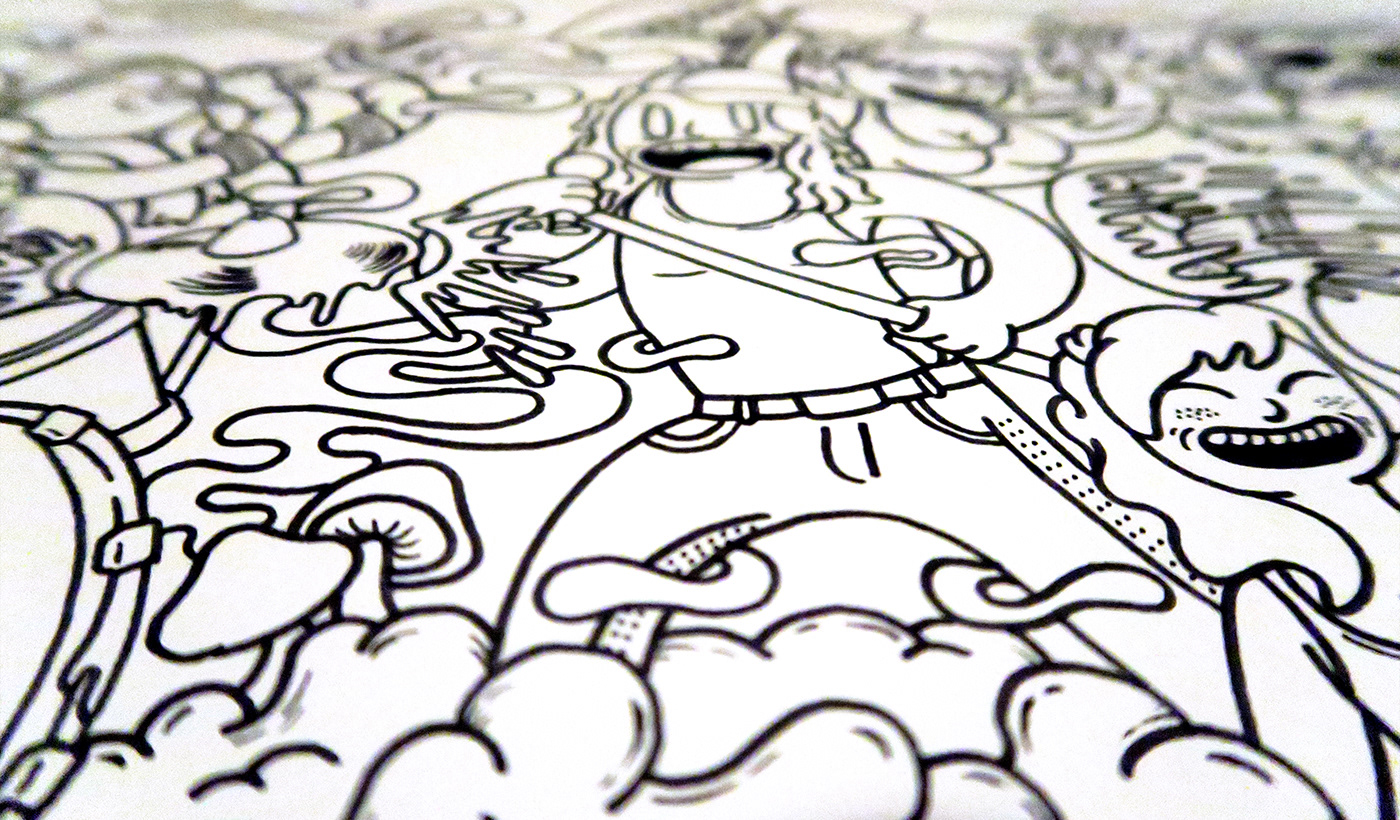
Below are much first sketches of characters, layout, and how the illustration developed.
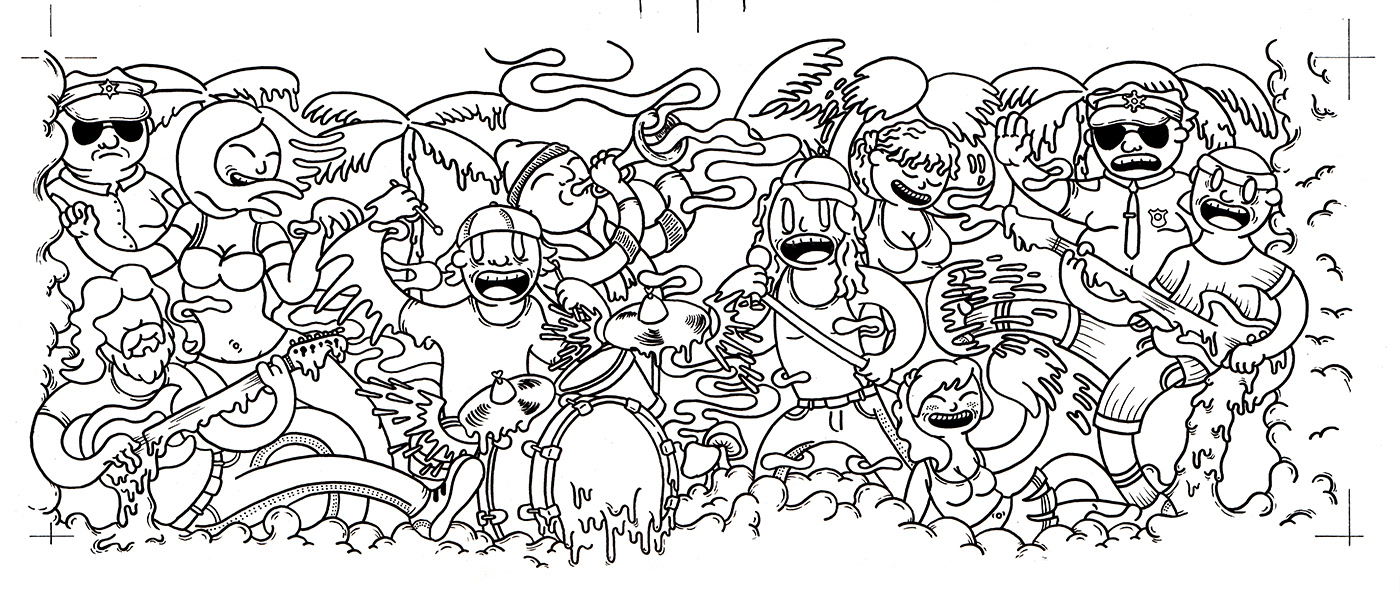
Final illustration, wine label and typography:
Below is the final wine label with my illustration. The pink border shows the die line (cut line).
Once the illustration was complete, the next step was to settle on what fonts would suit the design and illustration. San serif fonts seemed too computer age, serif fonts were too proper; I narrowed my choice down to a handwritten font. For the heading, I originally had in mind some custom hand drawn letting, but due to time constraints I decided to settle on an ‘inky’ styled decorative font.
I also wrote the description text on the side of the label, which describes the flavour of the wine using some lyrics from Hump De Bump. The wine is as funky as the music.
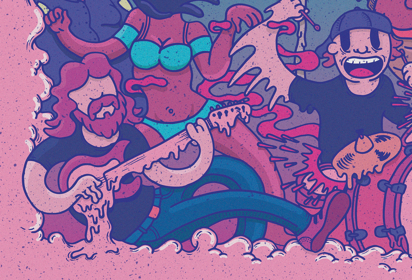
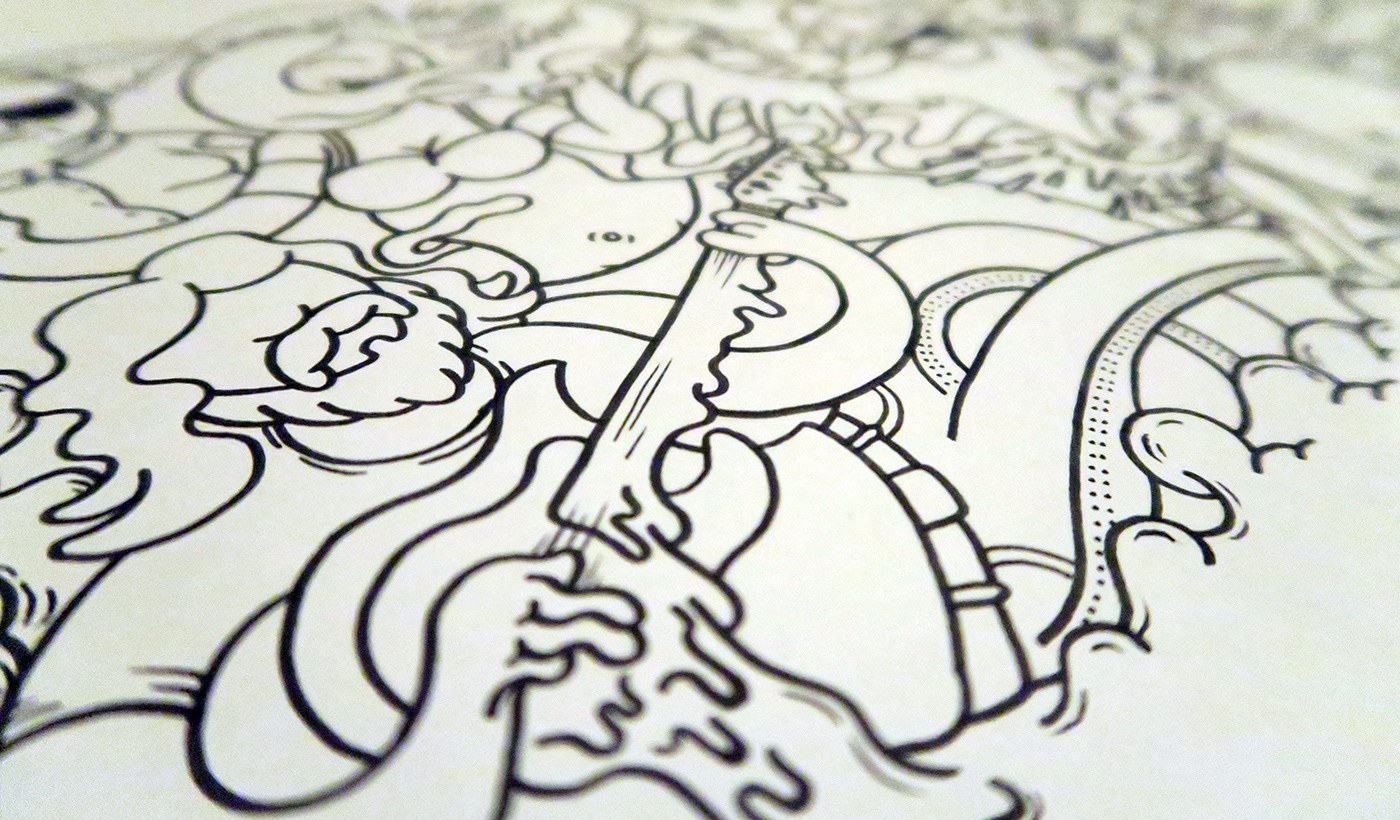
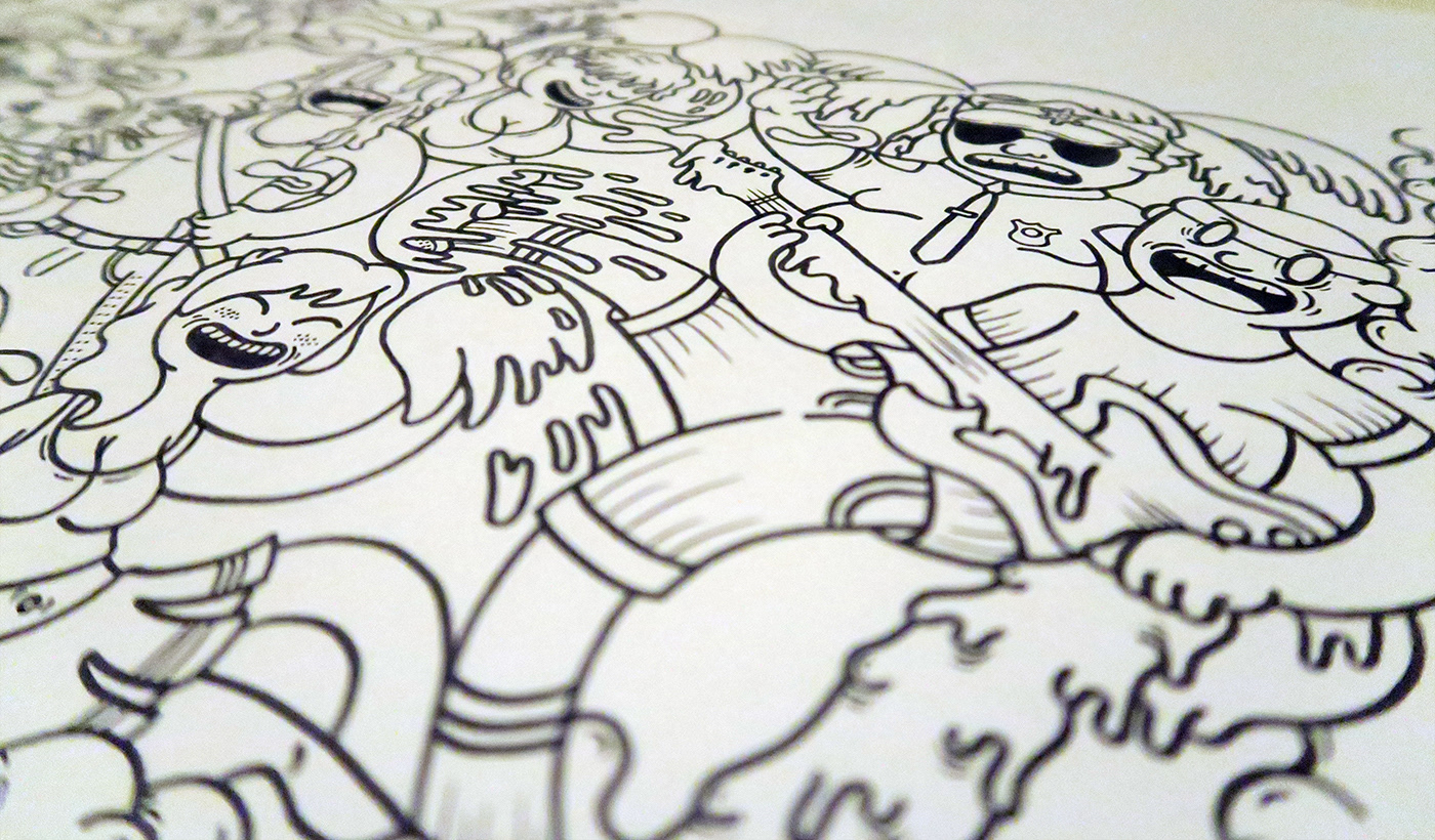
A close up of the illustration.
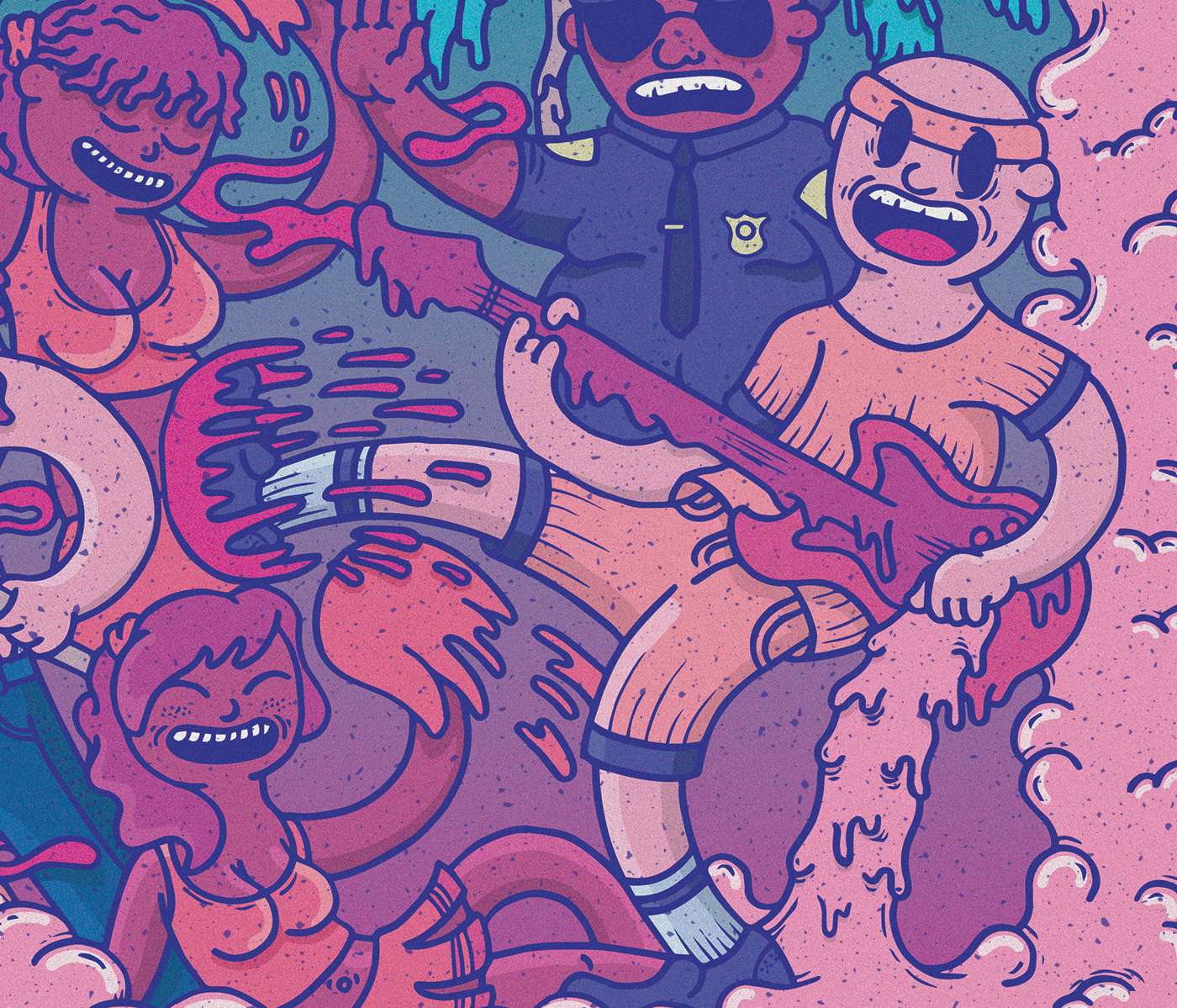
A close up of the illustration.
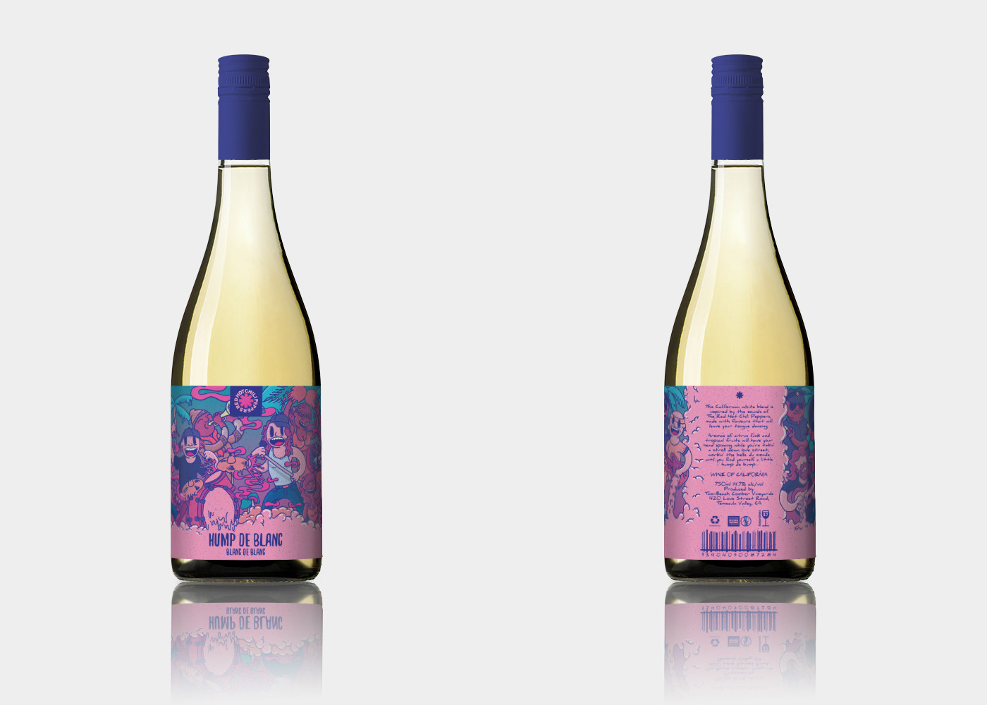
Final wine label on a bottle, showing front and back views.
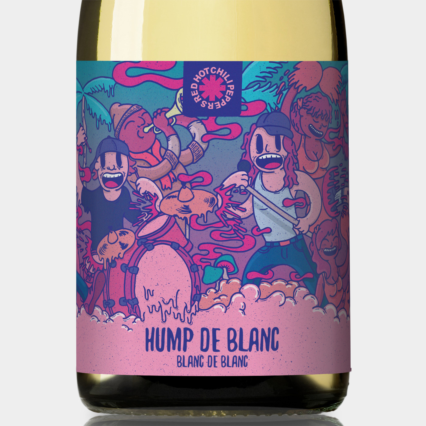
A close up of the wine label.
Thank you for watching.
Please click the beautiful blue button.
Please click the beautiful blue button.