The Honey Hunters are a group of Australian bears that bring nature’s best recipes to honey enthusiasts. I had the opportunity to work with these gentle giants to design a logo and product packaging while including my passion for illustration. The Honey Hunters currently have three different flavoured honeys for you to taste: Bear hug, Honey bunny, and Milk & Honey.
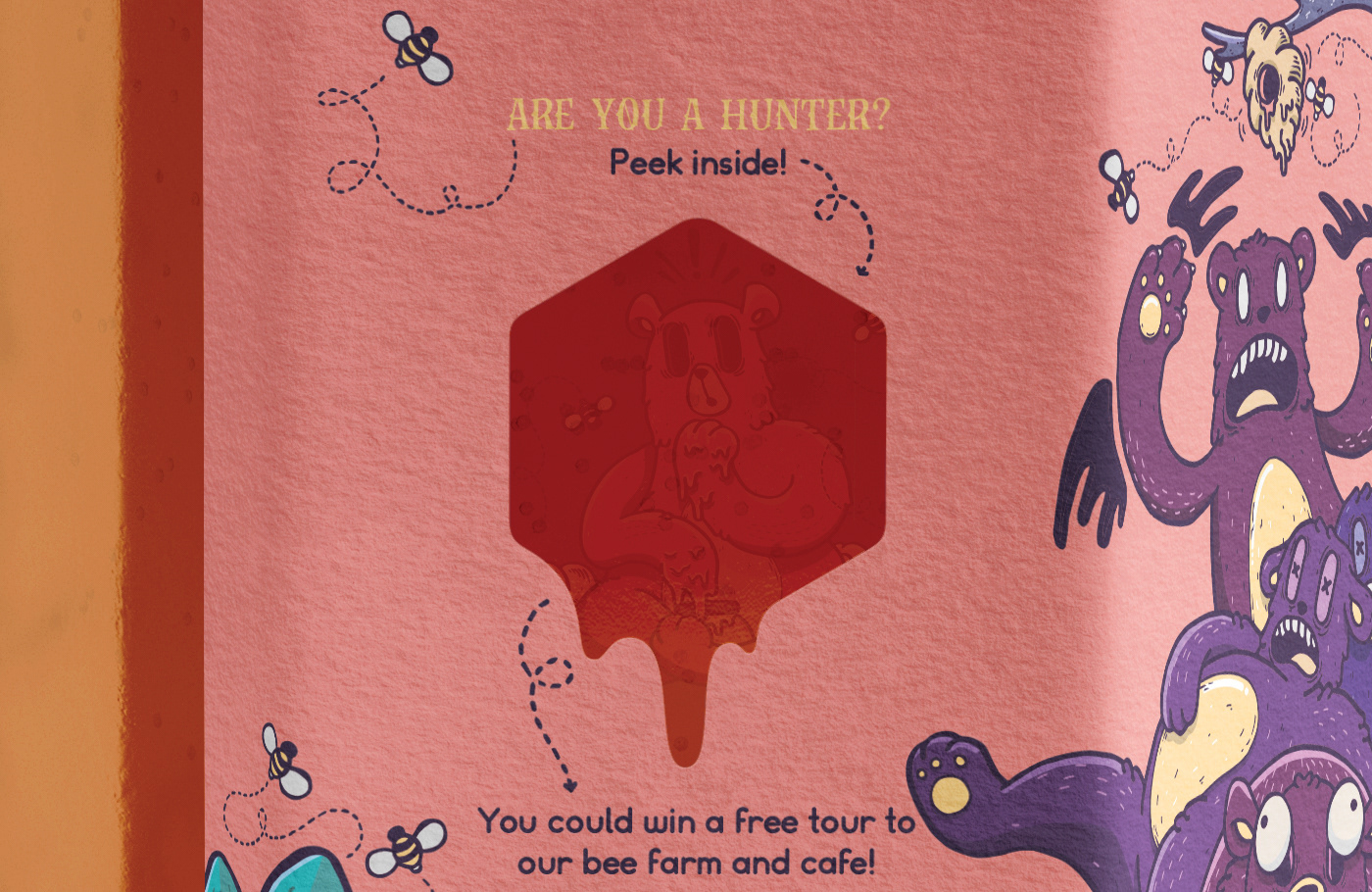
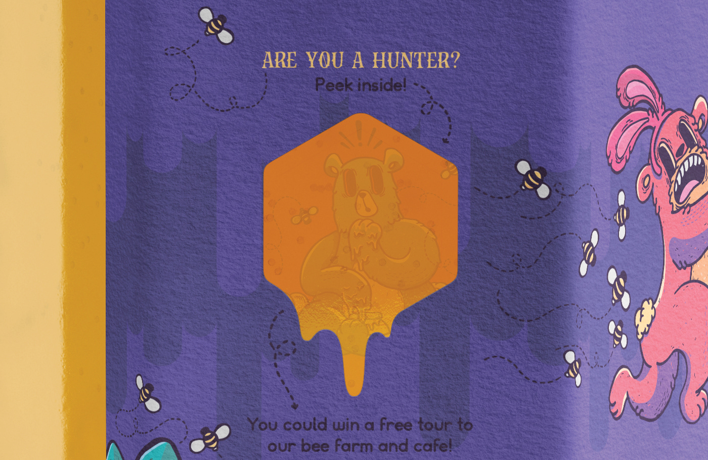
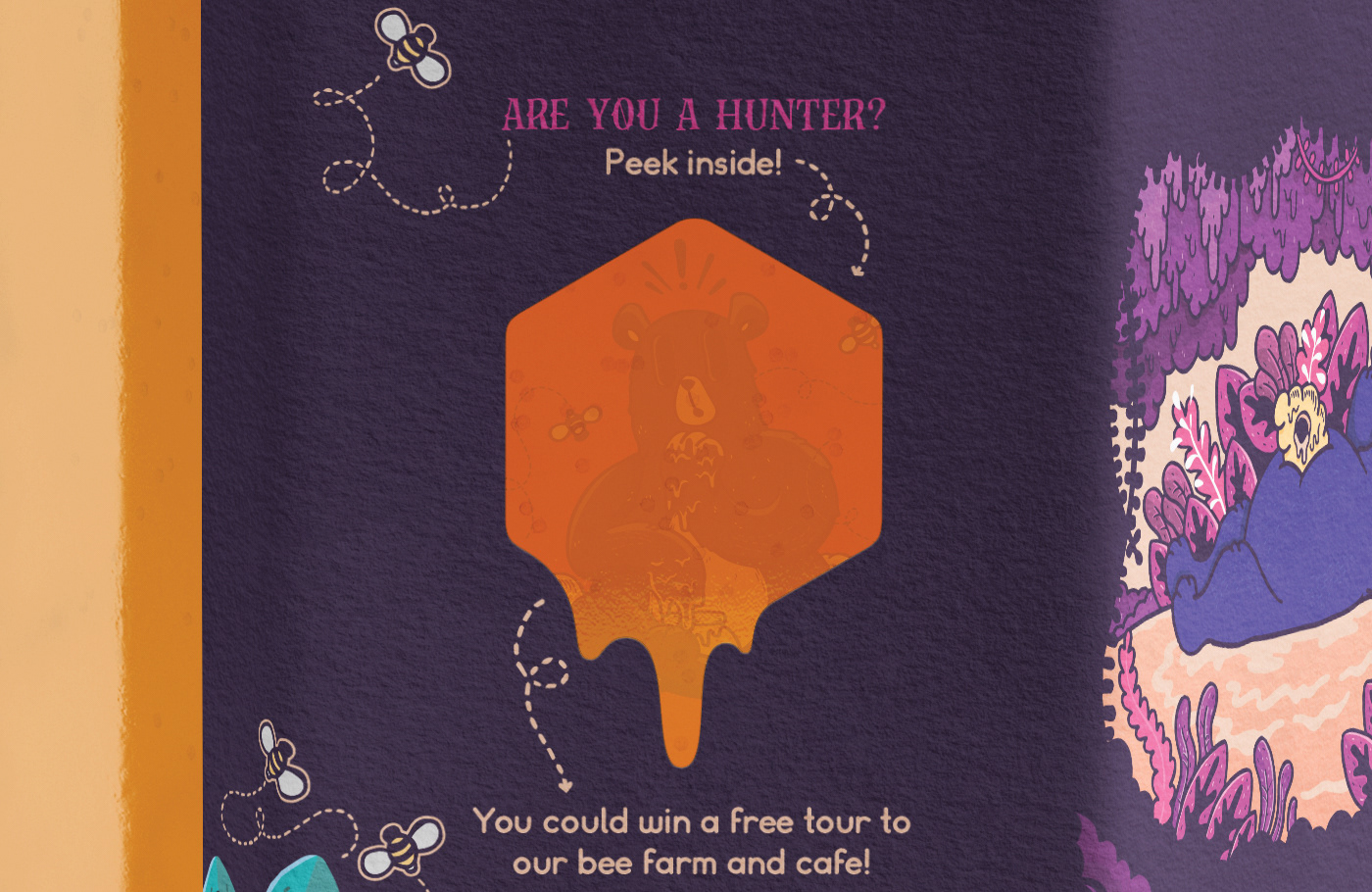
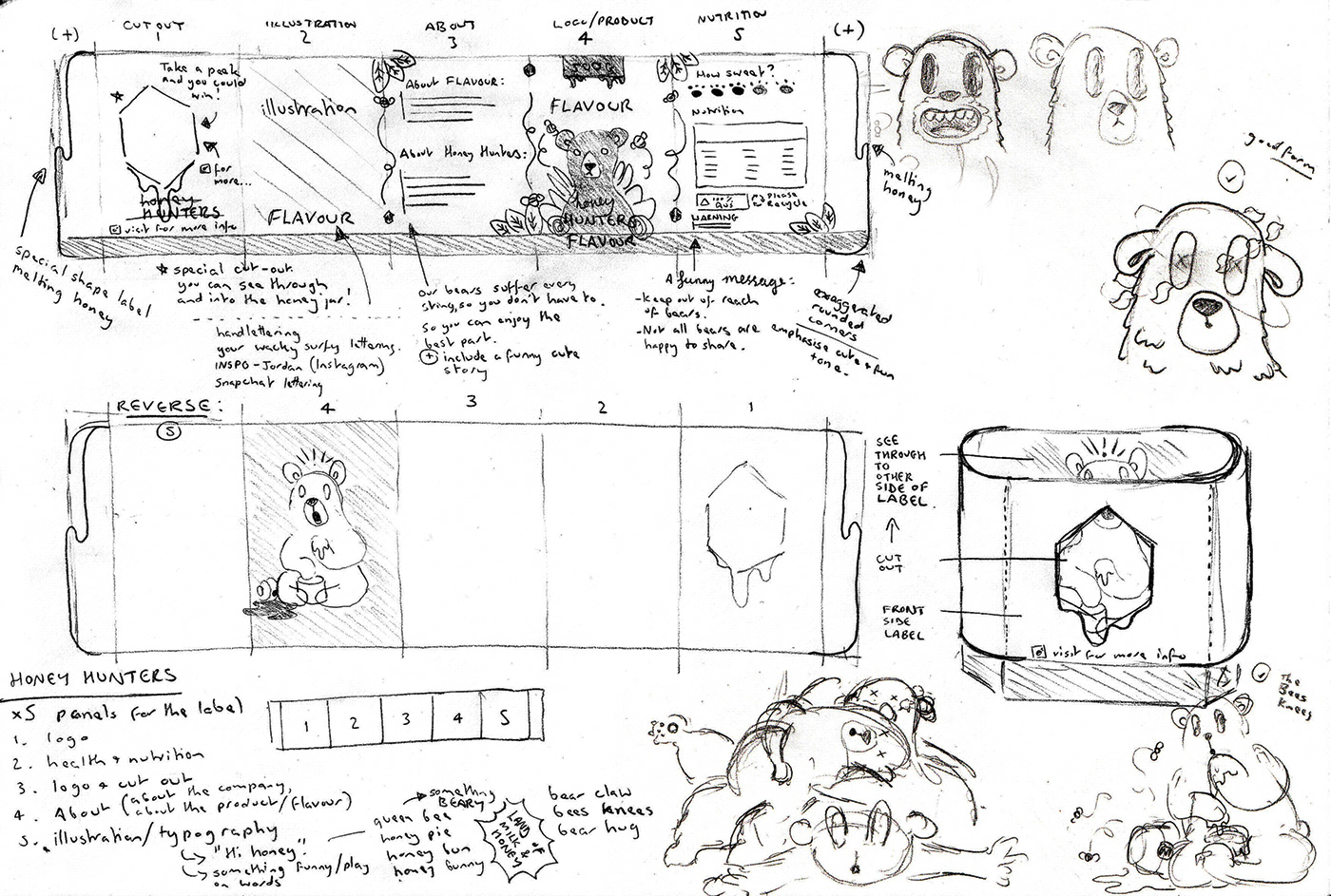
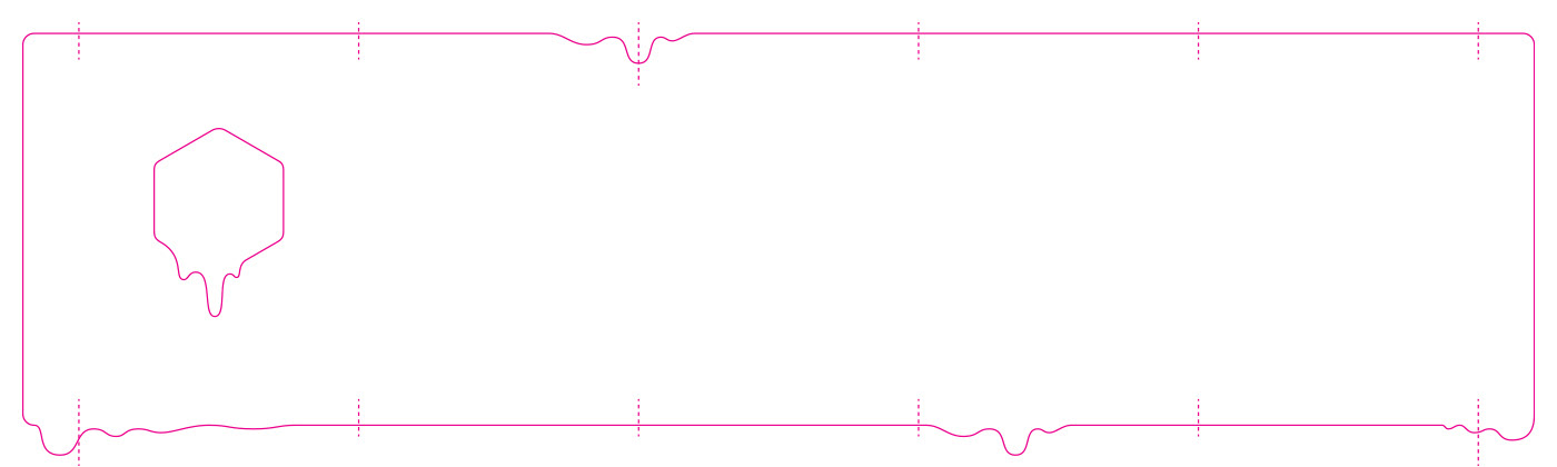
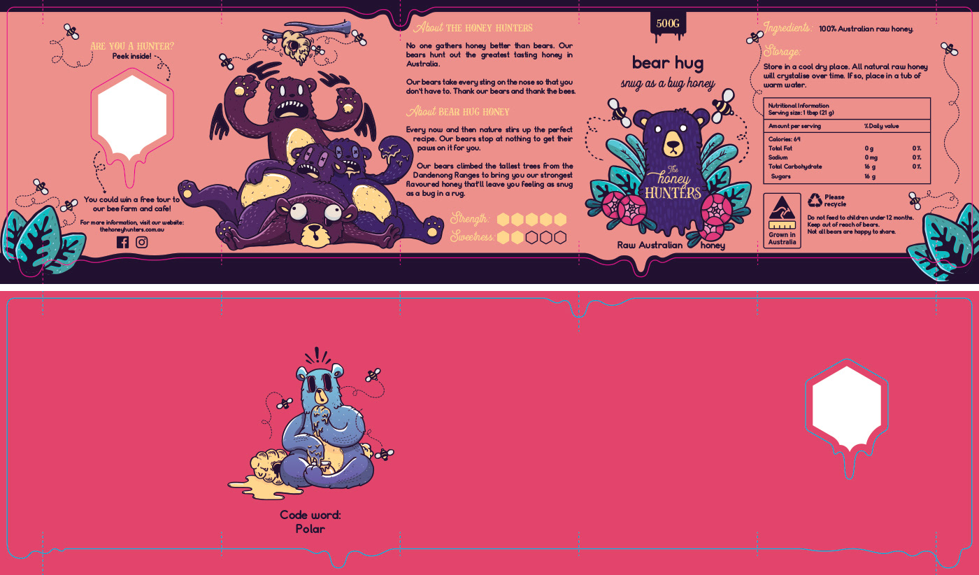
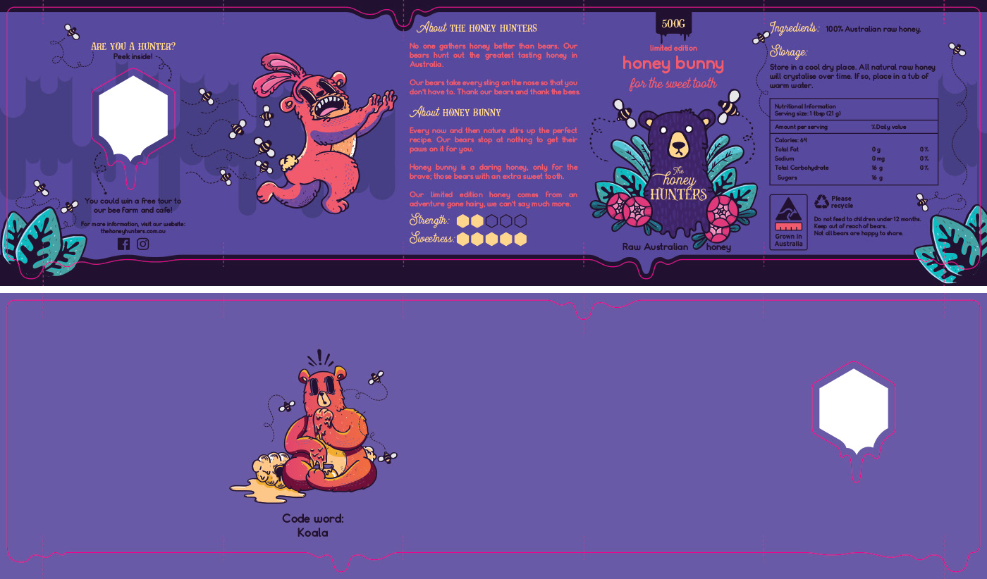
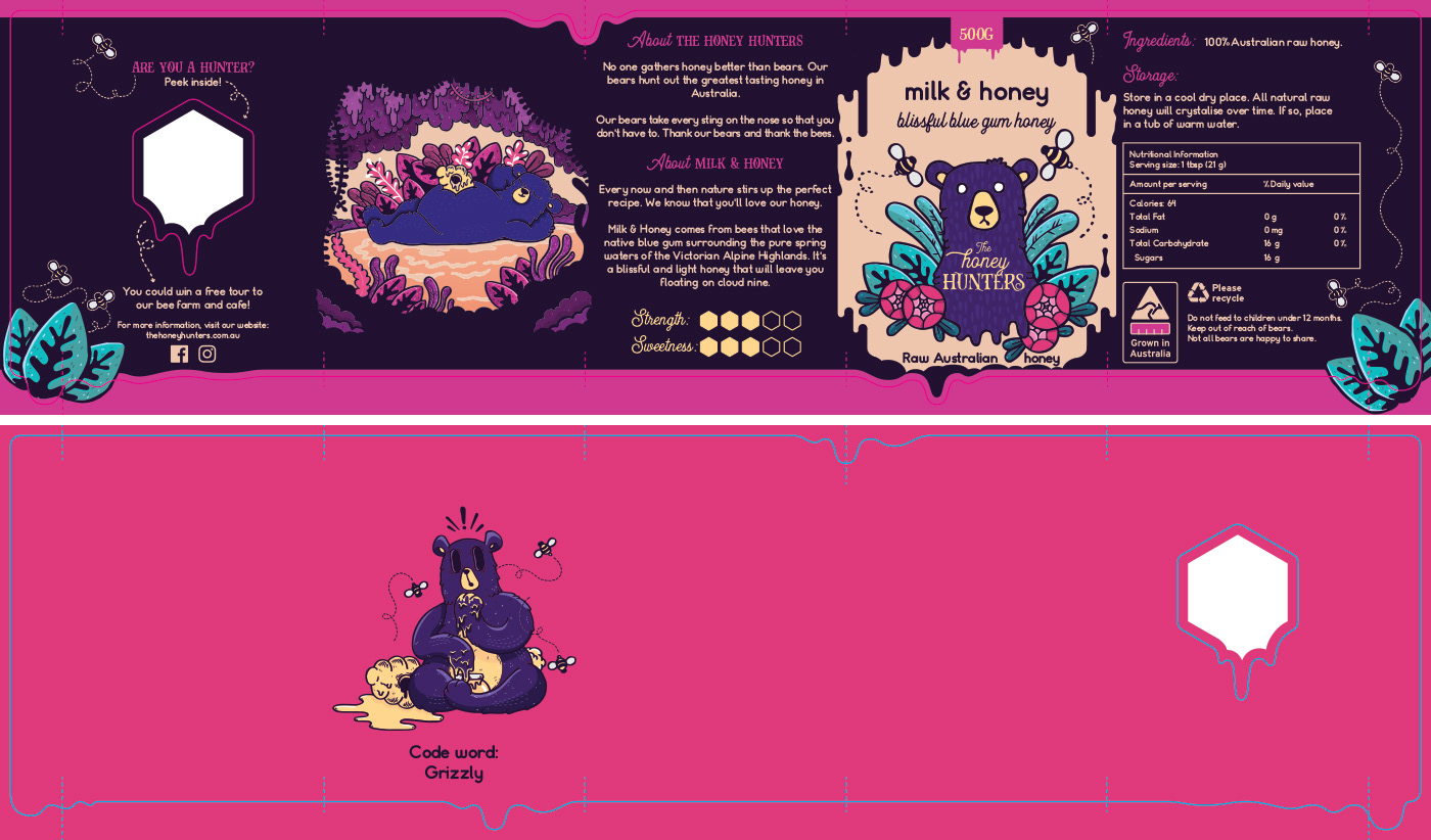
I created a unique label that would be applied to the honey jars which includes a special cut out and double sided printing. This is used for an online campaign where buyers could win a tour of the honey farm and cafe, with a chance to meet the bears themselves. A limited run of ‘winning’ labels were printed with a hidden bear and code word for people to find.
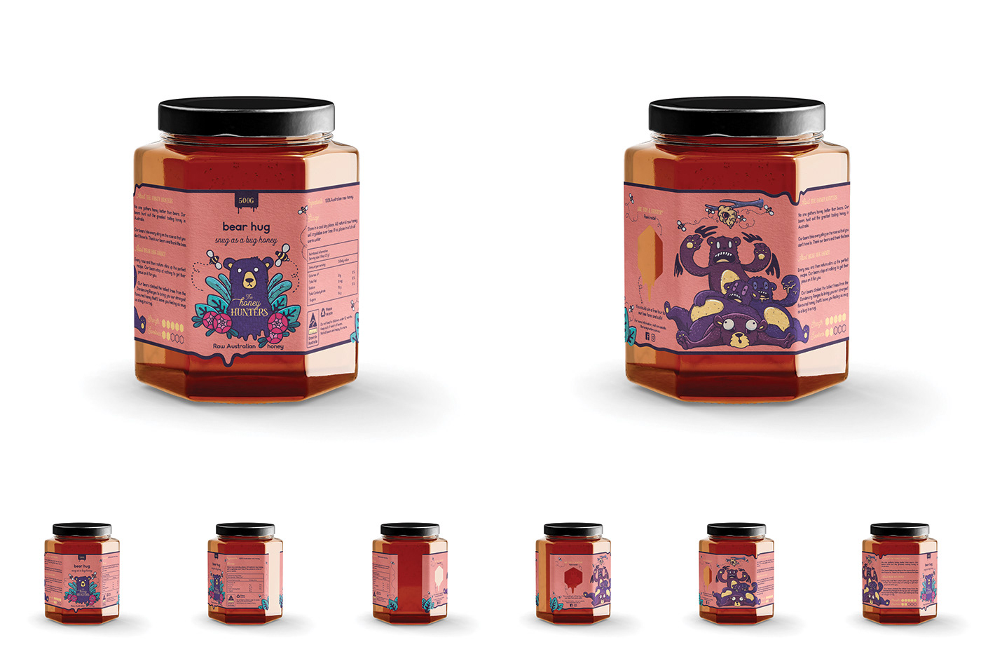
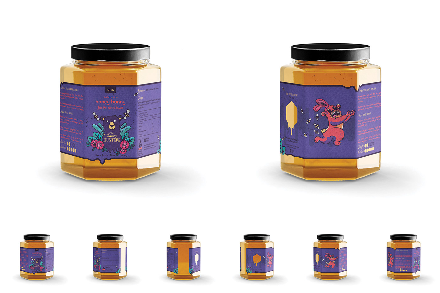
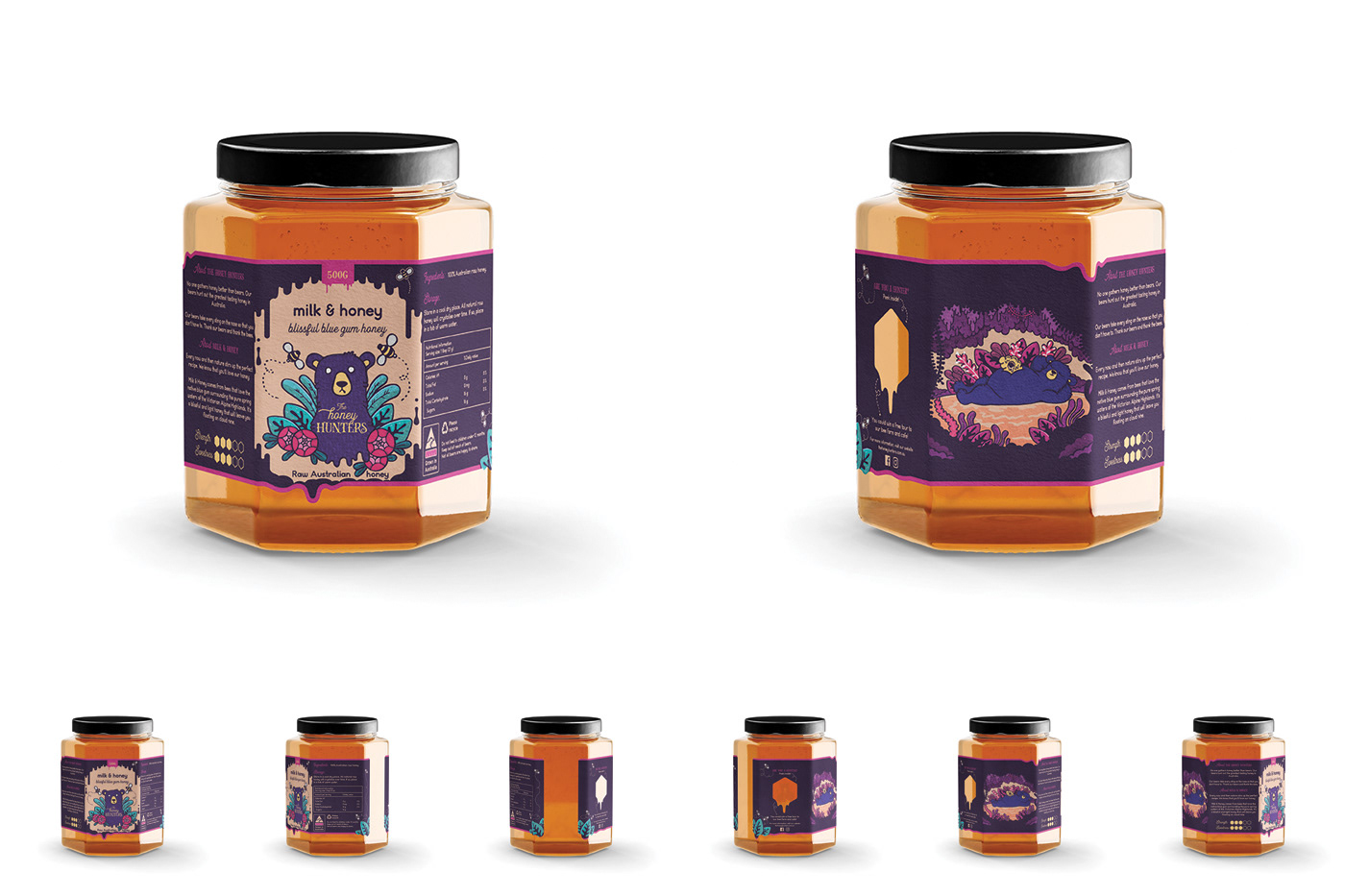
Below are close-ups of the honey jars with a 'winning' label. This image shows the print on the reverse side of the label through the honey. Beneath the sneaky bear is a code word. The lucky winner can go online to The Honey Hunters website or follow links through their social media to register their code word and book their free tour.
The Process:
Inspiration Board:
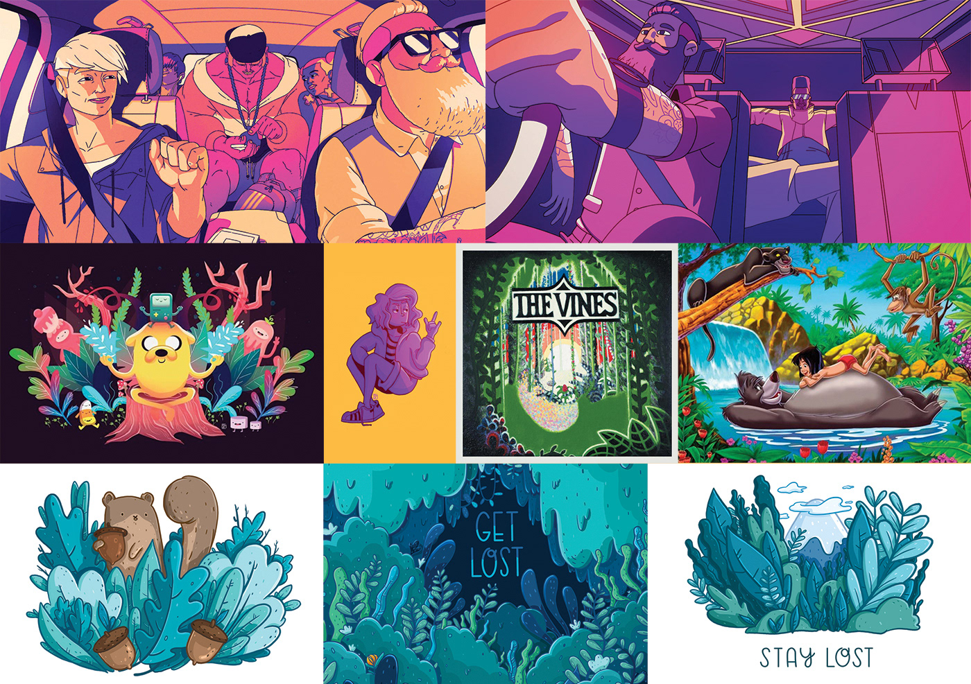
My favourite part of illustration is choosing the colour schemes. I wanted the illustrations and packaging to stand out with bright and vibrant fun colours. My main inspiration for my illustrations were Argentinian animator Le Cube (particularly his animation for Uber), American illustrator Megan Pelto, and Instagram illustrator and artist “Samanthaa.ma”. I also had a few other sources of inspiration as you can see below.
Brainstorming and ideas:
Next, I began sketching and developing ideas for the label and packaging solution. I knew from the beginning, from looking at the shape of the honey jar, that I wanted to include a special cut out where you could see the honey itself. I decided to do this with the shape of a honey cell (and the shape of the jar). Other ideas began to fall into place, such as including double sided printing to reveal a secret.
Below is the final die line of the label packaging. The solid lines show the cut/ knife line while the dotted lines show where the label folds around the jar.
Logo Development:
Next, I began sketches for the logo for The Honey Hunters. I wanted the logo to capture the process of what The Honey Hunters do and simplifying it. The bears go venturing into the Australian wilderness to find honey. The bear is the prominent character, surrounded by plants, with some bees (who create the honey) buzzing about.
The fonts I used are ones that reflect the natural cursive flows of the bees buzzing and the wilderness of the Australian bush land.
The process began with rough sketches and scribbles in my sketch book, which developed into a final pencil sketch (as seen below). From there I developed the final sketch to ink and bought it onto the computer where I digitally added colour and patterns.
I ended up with three different options of logos, but the middle one became the final.
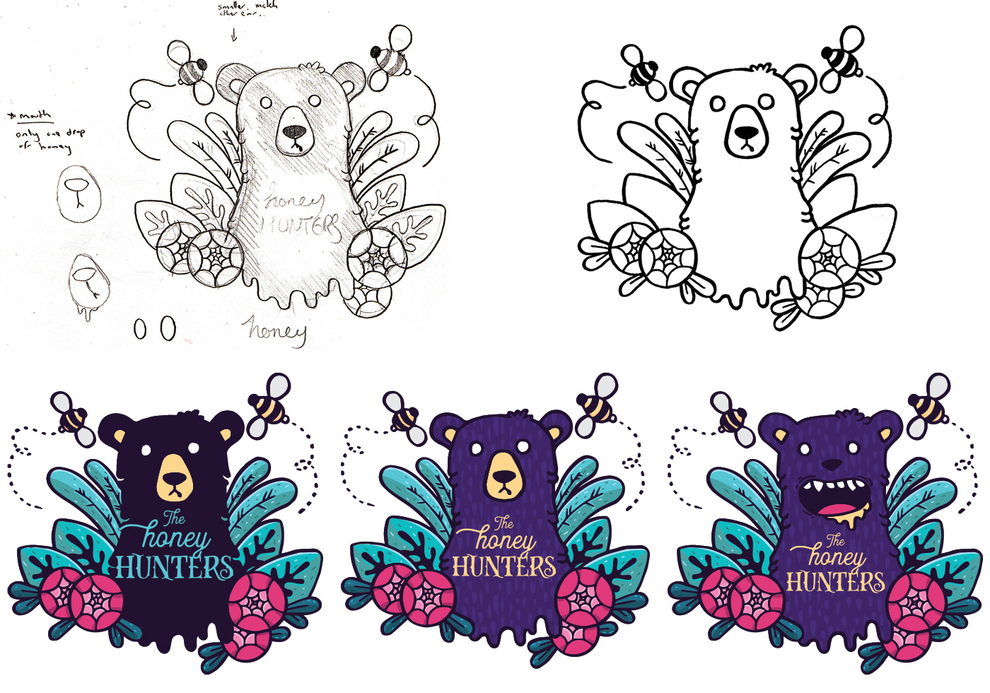
Illustration Development:
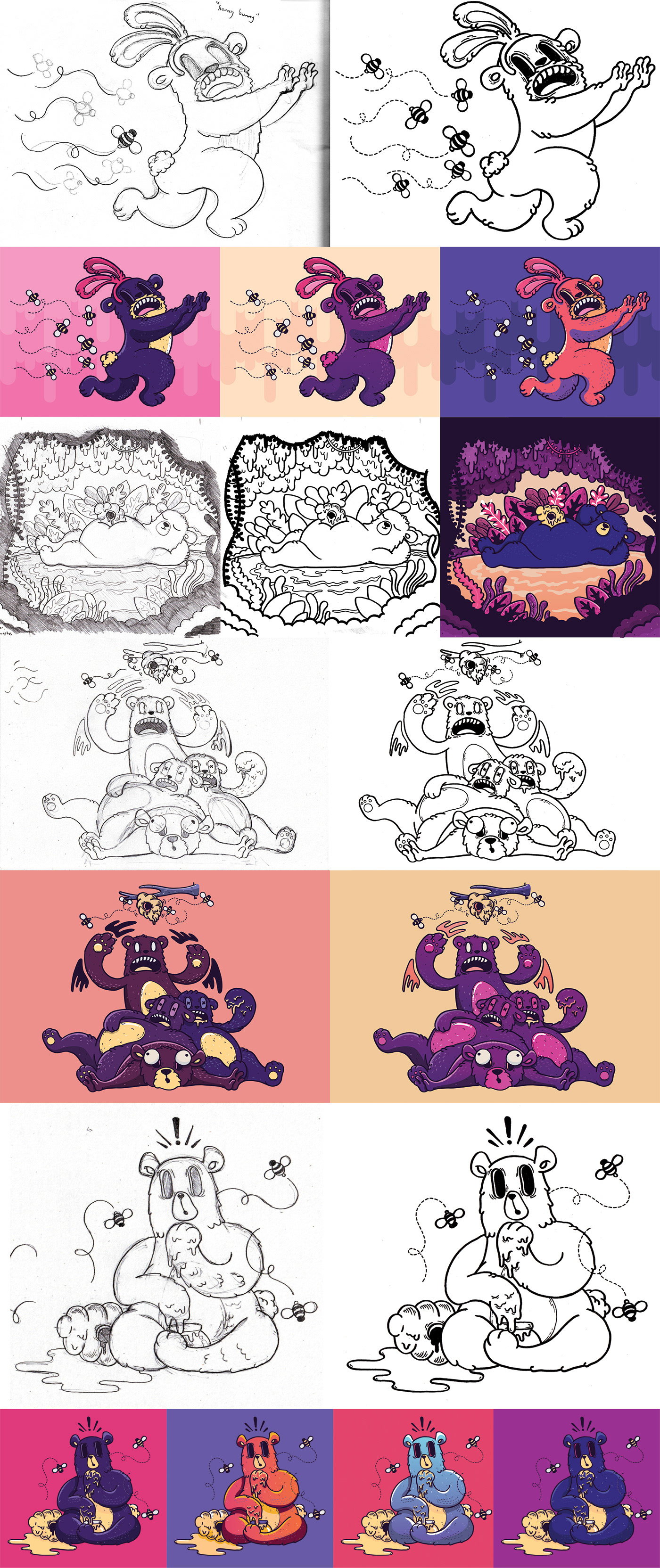
Once the logo had been finalised I began sketching illustrated characters, which would be included on the packaging. Each illustration reflects the flavours of the honey. This process was similar to the logo process: pencil, ink, digitalise.
I also enjoyed experimenting with different colours schemes and options, which I've included below.
The first illustration is for "Honey Bunny" which captures one of many unique methods that these bears use to sneak the honey from the very protective bees. This method, the bears would disguise themselves as a harmless animal in order to sneak to the honey. Unfortunately, the bees weren't easily fooled.
The first illustration is for "Honey Bunny" which captures one of many unique methods that these bears use to sneak the honey from the very protective bees. This method, the bears would disguise themselves as a harmless animal in order to sneak to the honey. Unfortunately, the bees weren't easily fooled.
Final Label Packaging Art:
Below is the final label packaging artwork, including The Honey Hunters logo and illustrated characters. The label artwork includes the die line overlaid and shows both the front side art of the label and the reverse side art of the label. The reverse side shows art of the limited run of 'winning' labels. All other labels do not include the secret bear and code word.
Thank you very much for watching. Please appreciate.